Last Exit is a local gem in Kent, Ohio—a coffee shop, bookstore, and vinyl house that serves as a hub for creatives, fostering a small yet vibrant community of writers, musicians, and artists. As a frequent visitor, I wanted my rebranding project to reflect the shop’s authenticity and the alternative spirit of those who gather there.

PROCESS
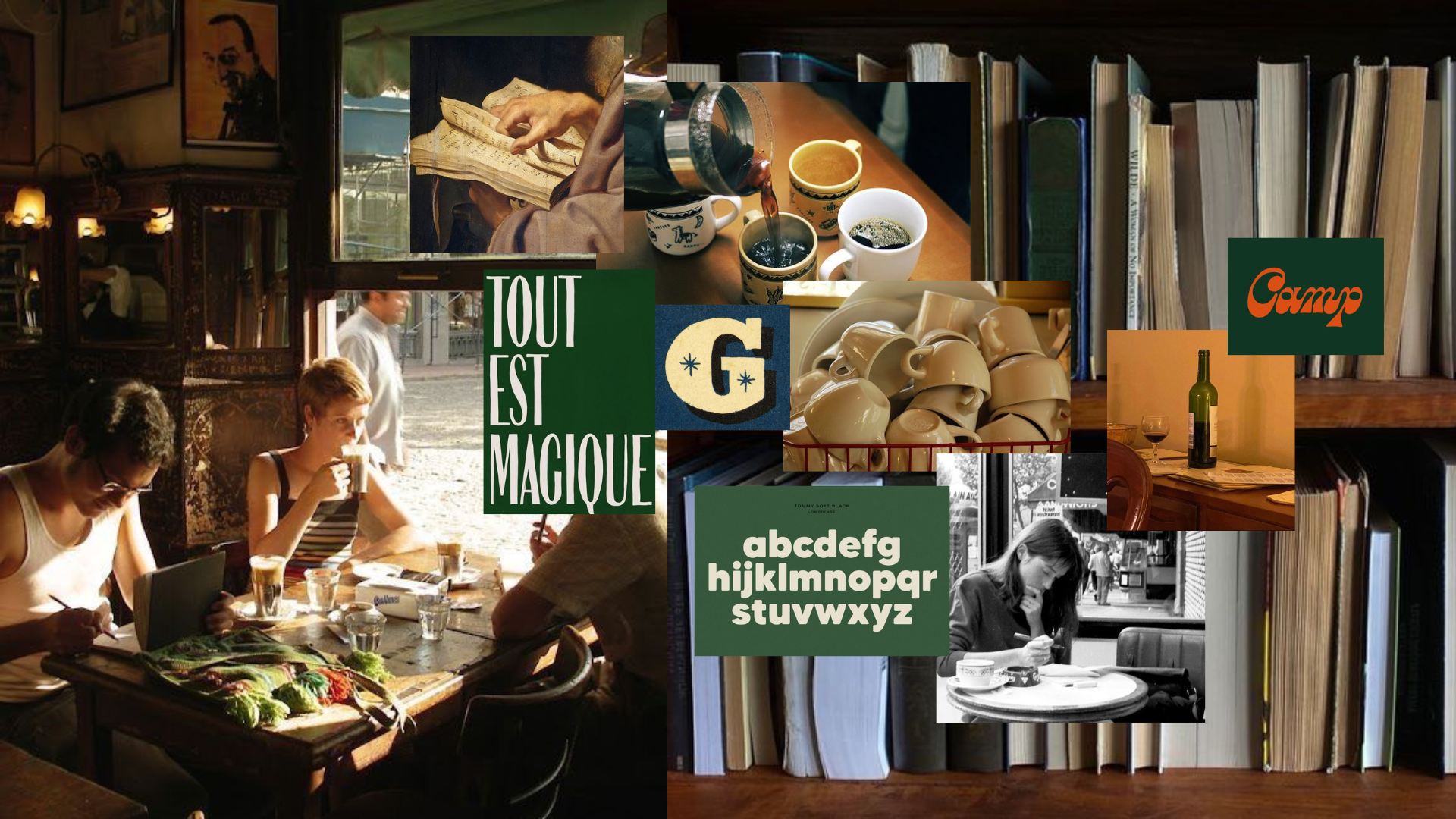
For this rebranding project, I conducted in-depth research to ensure the best results. I analyzed the café’s competitors, social media presence, and target audience while developing key questions to guide the process. Here, you can see two moodboards I created that reflect the inspiration behind my design.

THE LOGO
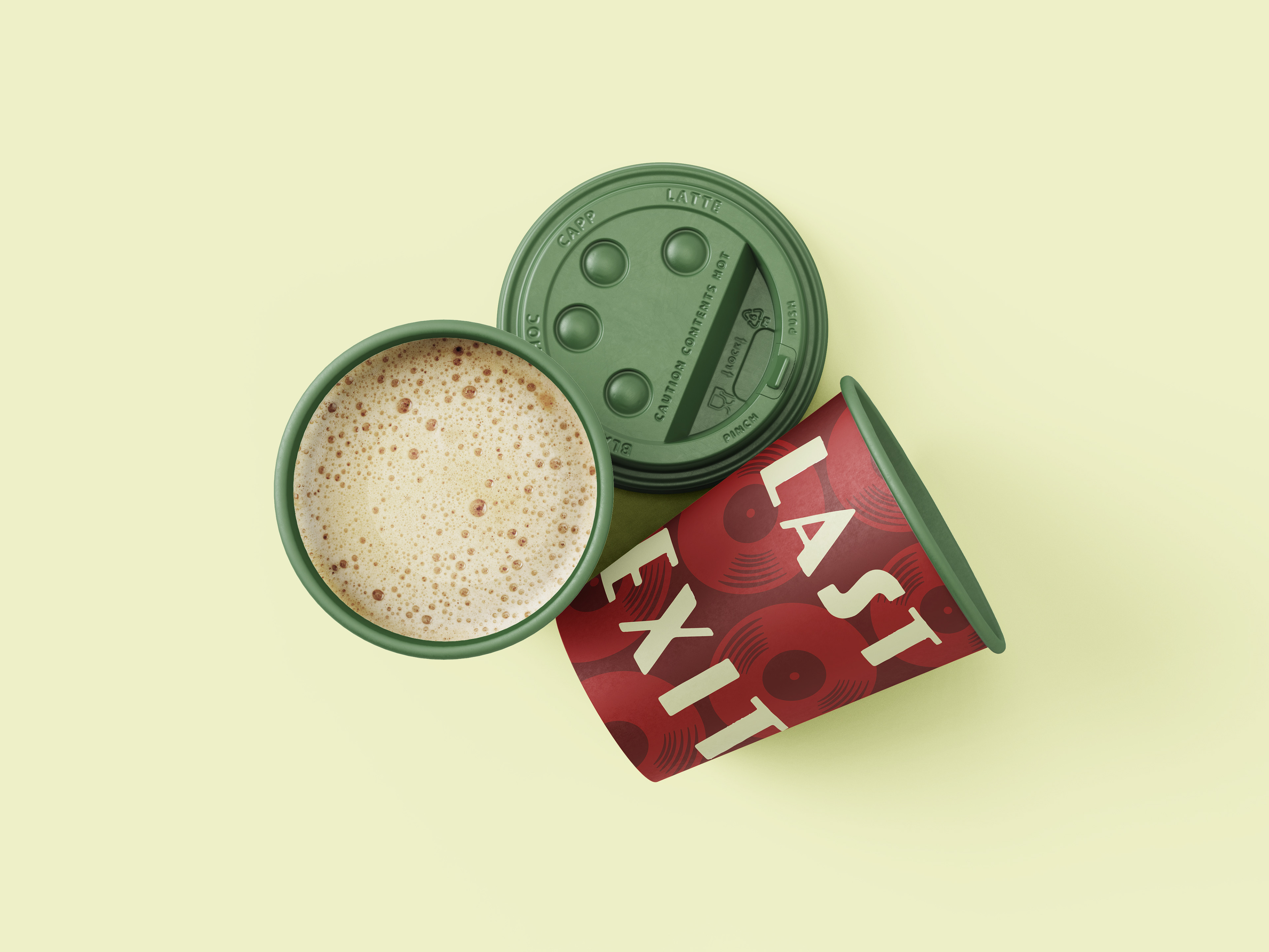
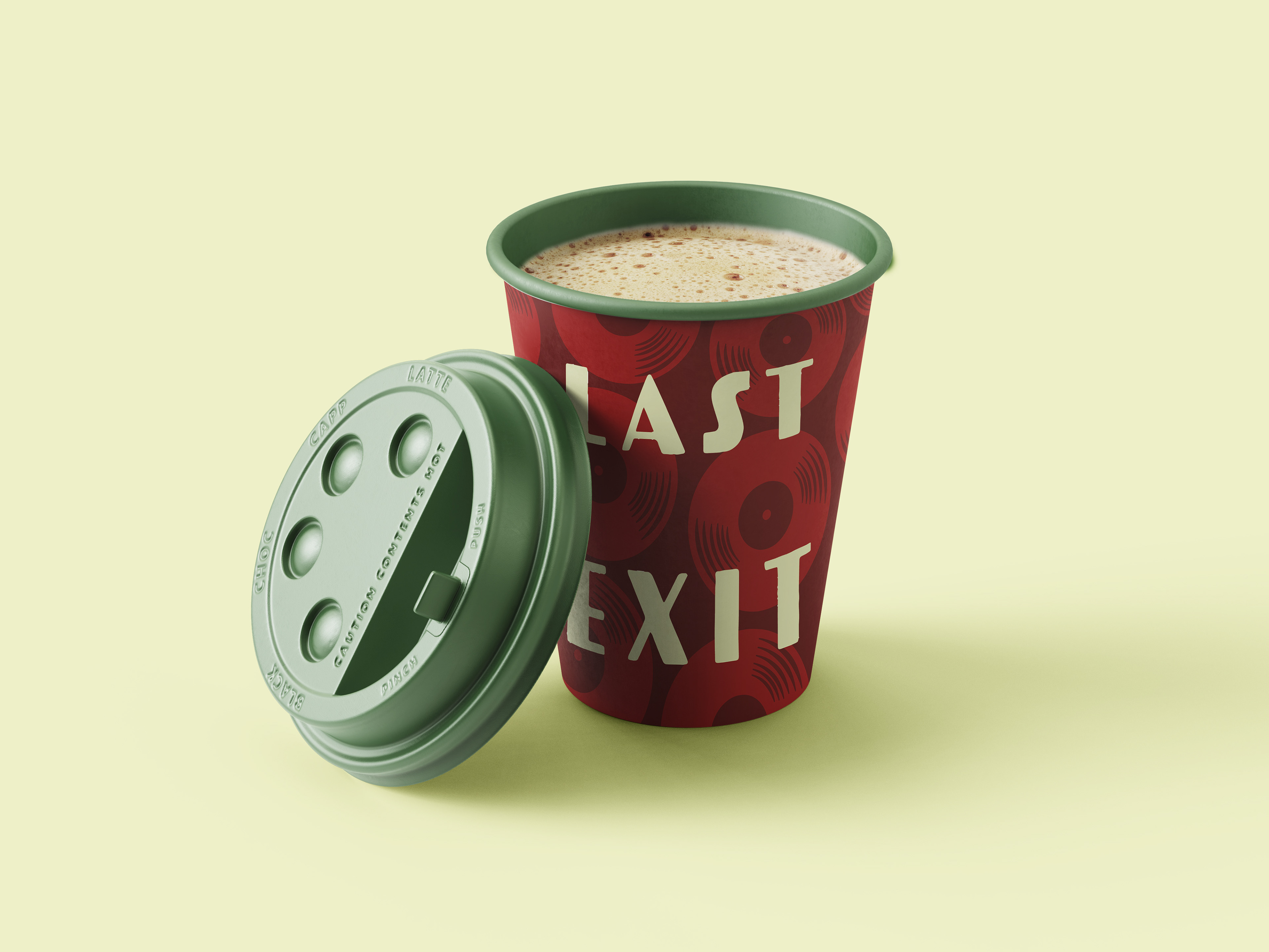
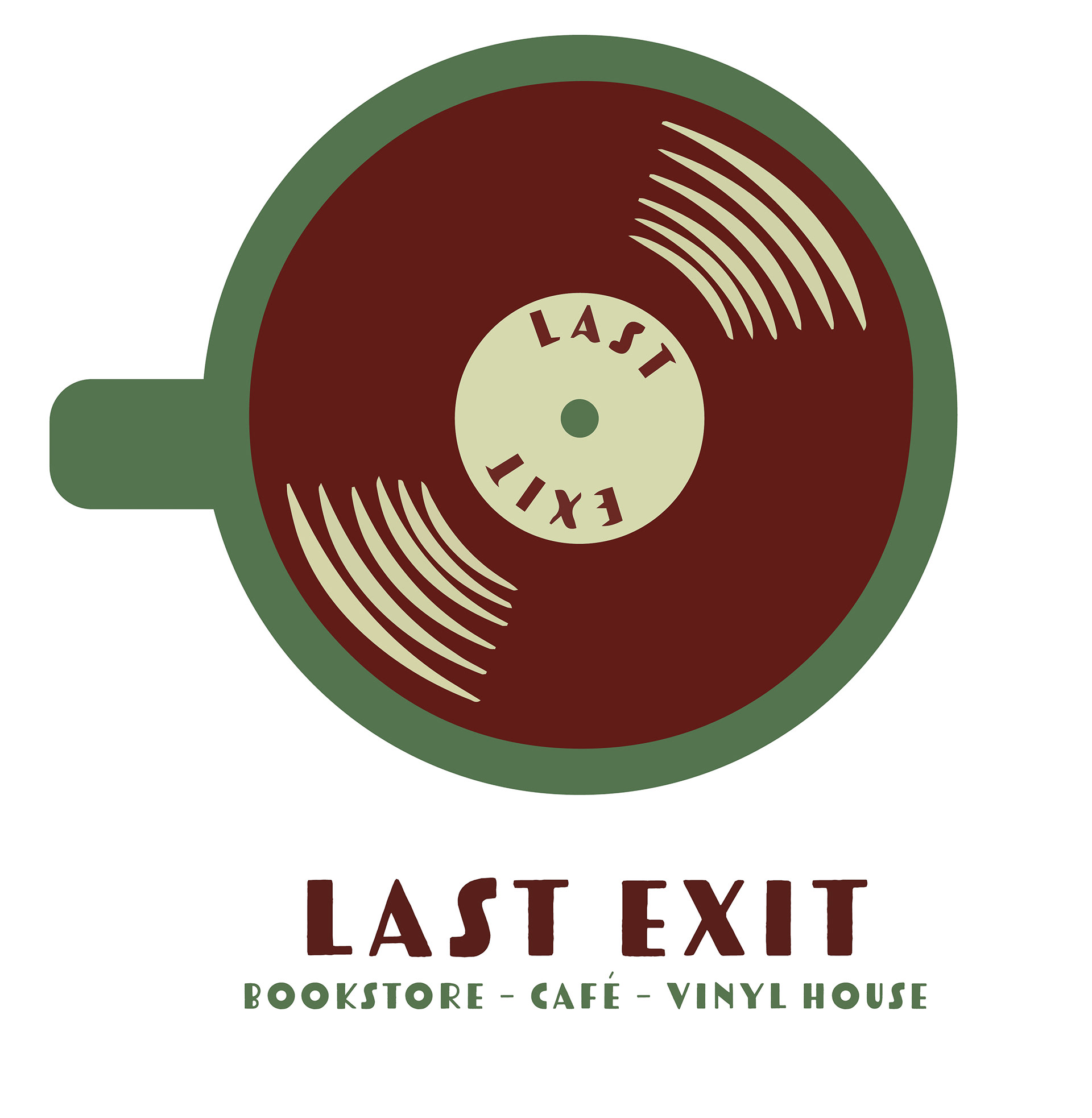
The logo for my Last Exit rebranding project brings together some of the shop’s core offerings—coffee and vinyls —into a single, cohesive mark. Designed as a coffee mug, the logo reveals a maroon vinyl record in place of the coffee. This visual metaphor ties the shop’s identity into one symbol, blending modern design sensibilities with vintage charm. I used art deco-inspired typography and a muted, retro color palette to reflect the space’s unique atmosphere—warm, creative, and timeless.
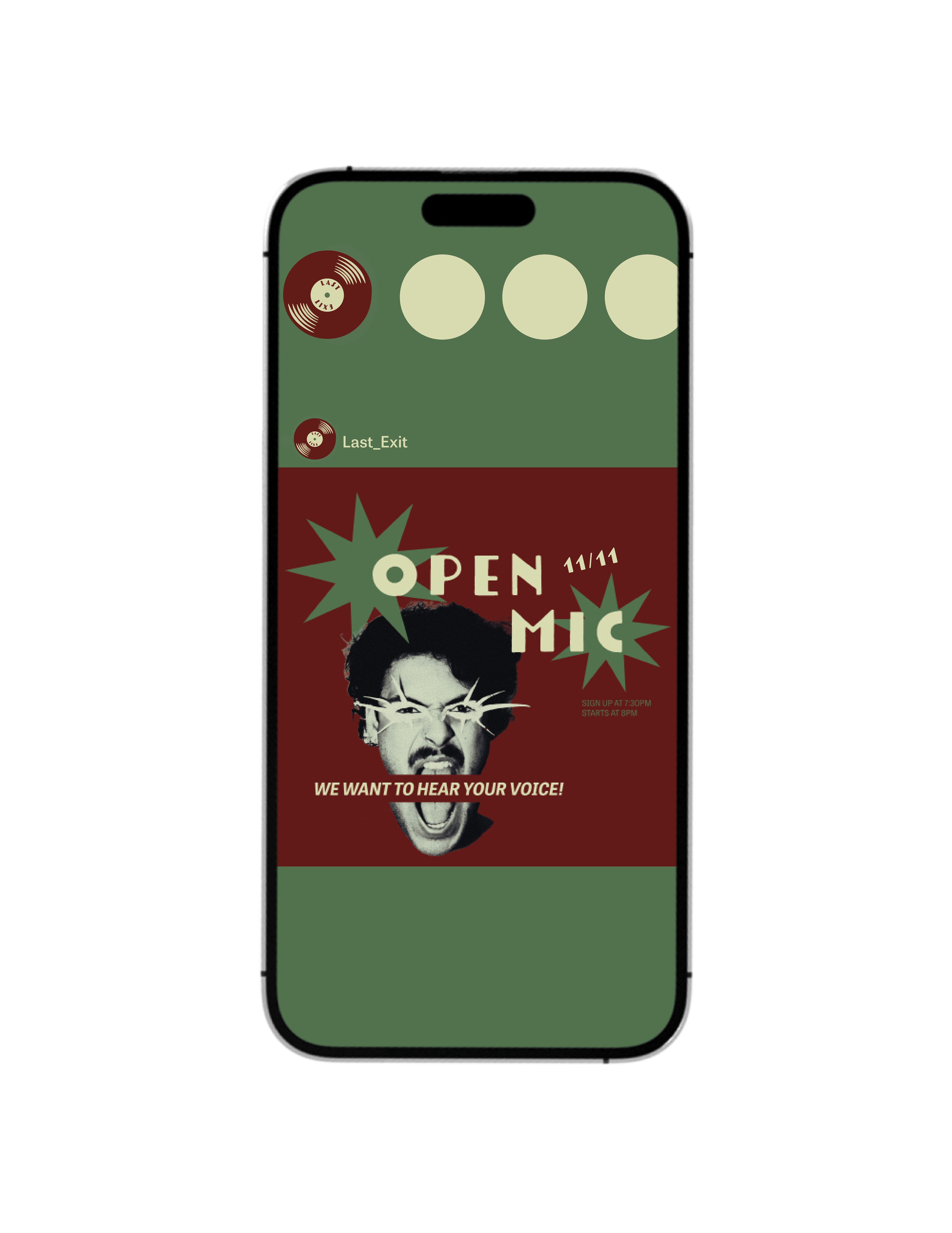
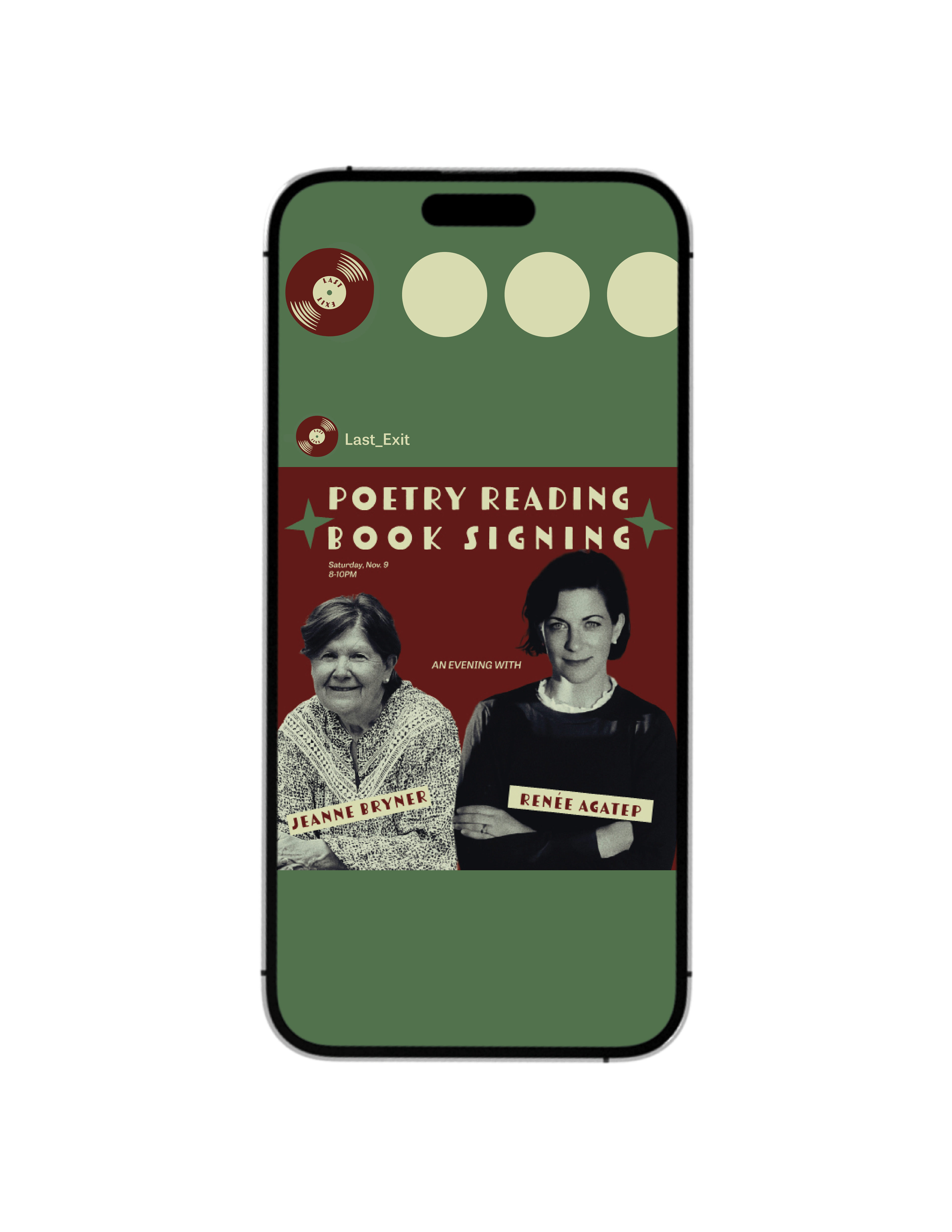
SOCIAL MEDIA
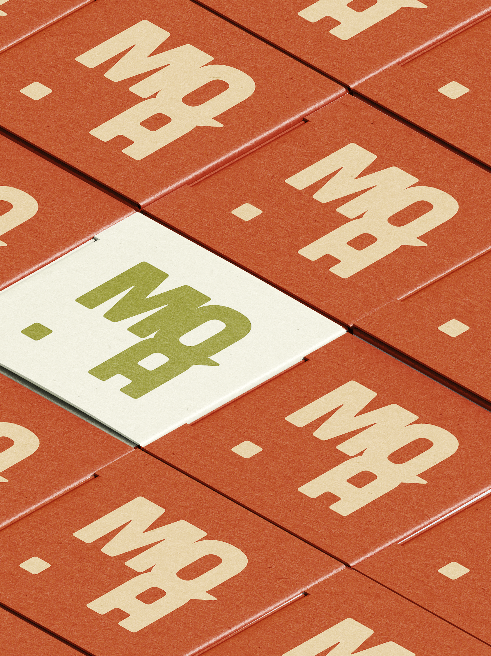
MERCHANDISE