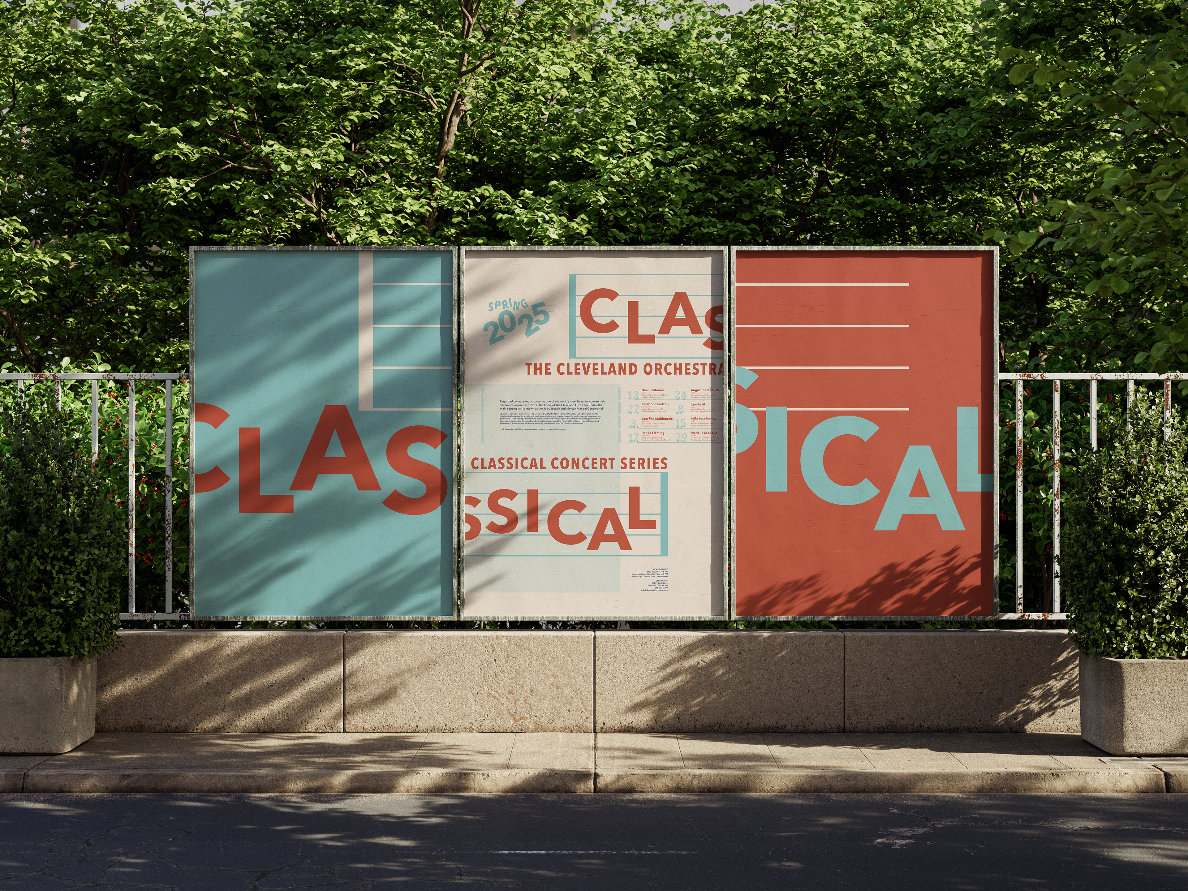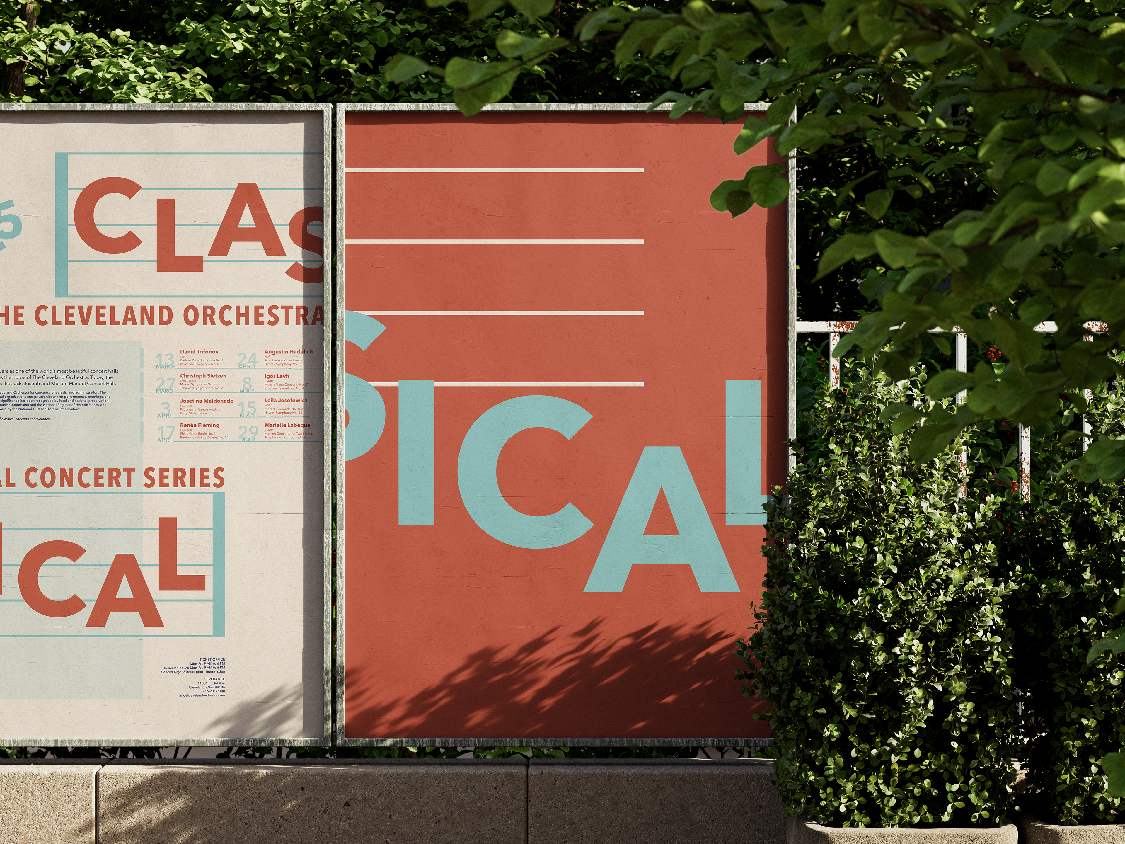
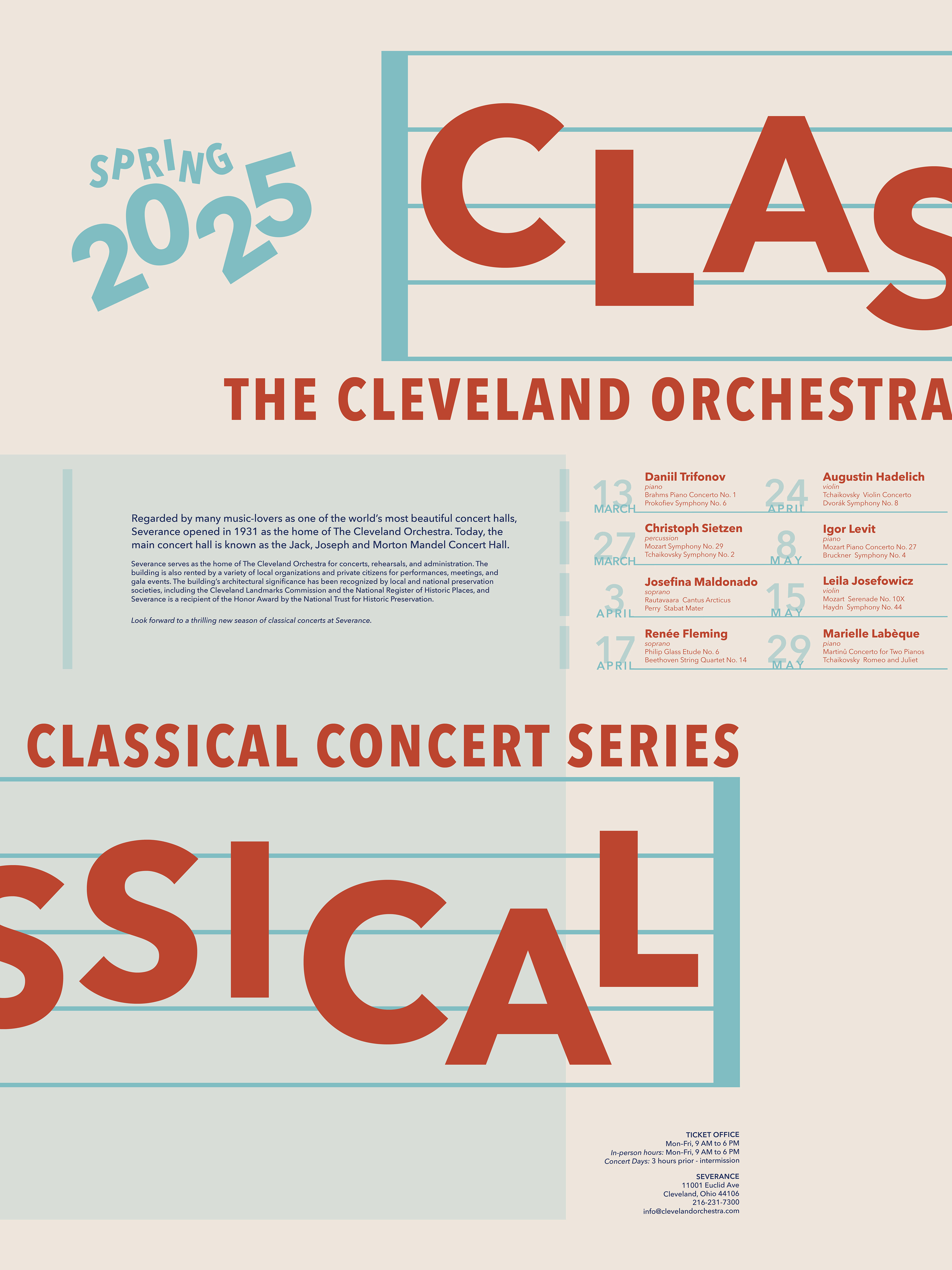
For this typographic poster series, I aimed to visually capture the movement and musicality of the Cleveland Orchestra. By strategically placing bold typography to mimic notes on a music sheet, I brought rhythm and flow into the composition, allowing the text to feel as dynamic as the music itself. To add depth, I carefully balanced color hues and transparency values, creating a layered effect that enhances the visual experience without overwhelming the essential information. The final design delivers key details clearly while maintaining a sense of playfulness, drawing the eye and inviting engagement.